|
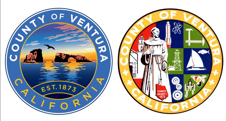
So the new county seal has been chosen. I don't like it because it represents nothing about the county. None of the history, culture, or industry about the county is represented. Even the geography isn't truly represented. A county's logo should be a representation of itself as a whole, not a piece of art. I guarantee you this seal was picked by the public specifically because it was the most picturesque. It "looked pretty." Democracy simply doesn't work.  Arch Rock is a very tiny piece of Ventura County that most people don't even know exists, even though you can see it from Ventura if you have decent eyesight (see the header of this page). It's not representative of the county as a whole. The county shaped logo is more representative and evocative of our landscaping. See the rows indicating farming? Also that view has got to be south from the Oxnard Plain towards Point Mugu looking into the rising sun, symbolizing a brand new day or future.  The new logo? The setting sun. It's not a new beginning, it's an end that is being symbolized. An end symbolized by a decadent new seal. And it's way too close to the Oxnard Police patch. Uncannily so. Credit for that obs goes to someone who shall remain nameless but he knows who he is. (Since I originally wrote this, someone pointed out that the perspective of arch rock is looking east, symbolizing morning and a new beginning. We are both wrong-the view through the hole is north/south. I would argue that my gut reaction is the correct one; us land-dwellers are looking out to sea, so we associate the islands with the sunset, not the sunrise.) Why did we need a new seal? Who knows. I see it as a waste of money and vanity. The supervisors have better things to do than waste time and money on the decadence of a new seal. Now a whole bunch of stuff will have to have new graphics slapped on. A decadent society is one that's in decay; pleasure matters most of all. Having a pretty little seal because all the other counties are doing it is just hedonistic.  Even though the old seal may be dated by today's standard, the old style conveys a timelessness authority. Think of the LA County or LAPD seals you see on official vehicles in our neighboring county. Can you imagine an LAPD car without the iconic city seal? Our old seal not only showcases the industry and history of our county but it looks official. It looks like the government, not some corporate thing. Companies rebrand themselves and change logos all the time. Governments don't. Governments are supposed to be timeless things and this should be reflected in their symbols. What represents Ventura County now? Endless housing? Industry in any real capacity beyond agriculture is gone. Rocketdyne? Gone. Oil? They're trying damn hard to kill it. We've forgotten who we are. Ventura County's children can't even afford to live here anymore. Plus Padre Serra is racist or something. So why not rebrand it? We could have at least chosen one of the alternatives that better represented our county as a whole or place with history. Instead our symbol is a birdshit covered rock on a barren island. We couldn't do Mugu Rock instead, which people see on TV all the time? Folks, this is why democracy doesn't work; republic representation does. People clicking on "what's the prettiest" gets you things like this because normal people don't consider anything beyond appearances. But since we're in a decadent society not far from total collapse, who cares? Our old seal will go into the history books along with all the things our once great county did. Comments are closed.
|
AuthorNote: this an adaptation from my non-fiction book Suburban Warfare: A cop's guide to surviving a civil war, SHTF, or modern urban combat, available on Amazon. Archives
December 2023
|
The information herein does not constitute legal advice and should never be used without first consulting with an attorney or other professional experts. No endorsement of any official or agency is implied. If you think this is in any way official VCSO business; you're nuts. The author is providing this content on an “as is” basis and makes no representations or warranties of any kind with respect to this content. The author disclaims all such representations and warranties. In addition, the author assumes no responsibility for errors, inaccuracies, omissions, or any other inconsistencies herein. The content is of an editorial nature and for informational purposes only. Your use of the information is at your own risk. The author hereby disclaims any liability to any party for any loss, damage, or disruption through use of the information. Copyright 2023. As an Amazon Associate I earn from qualifying purchases. Donut icons created by Freepik - Flaticon
